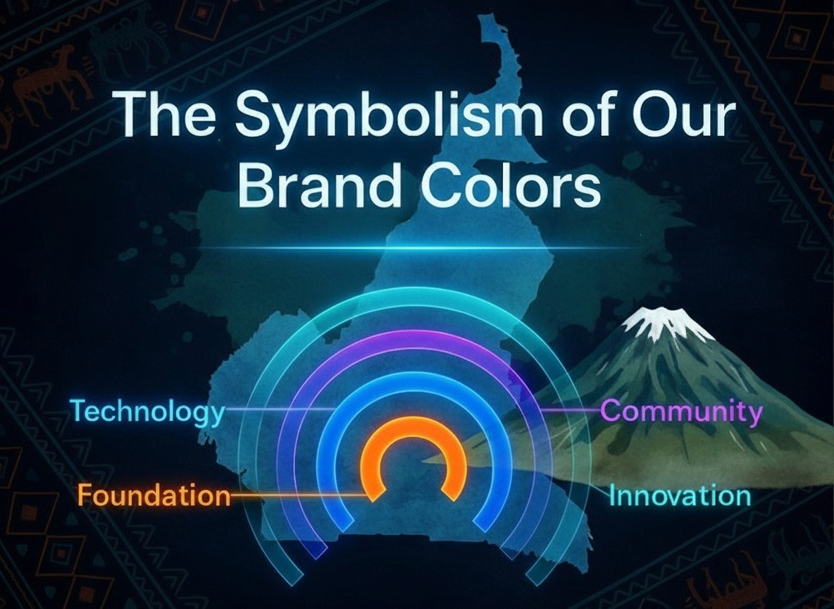
Our organisation’s visual identity is much more than a palette of pretty colours. Each hue - orange, blue, purple, and green - is an emblem of who we are and what we stand for. This design weaves our brand identity with our organisational mission, local culture, and marketing strategy.
Orange: Foundation (Strength and Roots)
Orange is the colour of foundation, drawing inspiration from Cameroon’s soil. In many parts of the country, especially around the capital Yaounde, the earth is a rich reddish-orange clay. It’s the kind of soil that leaves dust on your shoes and reminds you of home - quite literally the ground we stand on. This red earth isn’t just scenery; it’s the stuff people use to build with. In rural Cameroon, the same dense red soil, mixed with water and trodden underfoot, is used to bind sun-dried bricks together when constructing houses.
By choosing orange, we signal that our work is rooted firmly in Cameroonian reality - as solid and dependable as the ground itself. The orange foundation hue conveys strength, stability, and a down-to-earth reliability. Culturally, earth and land carry the meaning of legacy and ancestry - the idea of laying groundwork for future generations.
Blue: Technology (Progress and Trust)
Blue represents technology in our brand, symbolising progress, connectivity, and trust. Technology here isn’t abstract or foreign - it’s the bridge linking Cameroonians to new opportunities. Blue in our palette echoes the bright sky over Mount Cameroon’s peak and the vast Atlantic along our coast - it suggests a wide-open possibility.
From a mission standpoint, this colour reinforces our focus on digital solutions and educational technology. Our organisation works to bridge the digital divide and bring modern skills to communities. Blue tells communities “we will connect you” - to information, to services, to each other. It also tells partners and funders that we are technologically adept and forward-looking, yet grounded in trust.
Purple: Community (Unity and Diversity)
Purple stands for community, embodying unity, diversity, and the rich culture that powers our mission. Cameroon is often described as “Africa in miniature” for its incredible diversity - over 200 languages, multiple religious traditions, and dozens of ethnic groups coexist in one country. Rather than being a weakness, this rich tapestry of varied cultures has the potential to become a strength if people come together with common purpose.
We chose purple to capture that idea of unity in diversity. Visually, purple is created by blending two strong colours, which is a nice metaphor for different groups merging to form something beautiful. When someone sees purple in our logo, we want them to think of people gathered together.
Green: Innovation (Creativity and Transformation)
Our fourth colour represents innovation - the creativity and forward-looking ideas driving our work. Green evokes images of fresh growth and clear fields. It’s the colour of renewal: think of the lush green of Cameroon’s forests meeting the blue of its rivers. By choosing this colour, we signal transformation - new solutions emerging from the meeting of tradition and modernity.
When we say innovation, we don’t mean innovation for its own sake. We mean practical innovation, the kind that improves lives in tangible ways. The vibrancy of the green also injects hope and momentum into our brand identity. It’s optimistic - the tone you’d associate with transformation and new beginnings.
Our Unique Story
Each of our four colours carries its own story, but together they form a coherent narrative about our organisation’s identity and purpose. Orange roots us in the strength of Cameroonian soil. Blue carries that foundation forward through technology. Purple reminds us that people are the heart of our efforts. Green points upward and outward, to innovation and transformation. This carefully chosen palette makes our brand instantly recognizable and meaningful: it visually encodes our mission to empower communities through education, technology, and sustainable change.